
Imagine turning the key, opening the door, and stepping into the familiar light, comforting smells, and soothing sounds of the place you call home.
We can all relate to this feeling and crave the revitalizing energy only found in our own homes. But why? And, probably more pressing – what does this have to do with your website’s homepage?
The psychology is simple – we all crave the familiar. It’s why we eat at the same restaurants, have a “go-to” Starbucks order and take the family dog on the same walking route nearly every day.
Hopefully by now you can see how this thought translates to your homepage. Your business is unique, but at the end of the day we all crave the familiar.
Websites that provide new visitors with an experience that feels instantly familiar and intuitive typically enjoy the most success.
Research indicates that you have 5 seconds to either impress your new visitor or watch them bounce away to the next page – potentially to your competition!
Give your website the 5 second test.
In this post, we will discuss the top elements of a successful homepage, one that puts new users at ease, communicates your vision, and at the end of the day makes you more money.
Let’s start at the top of the page.
A user-friendly menu
Most websites include a menu at the top or close to the top of the homepage. How do you know what is worthy of this precious page real estate?
Long story short: Only what is necessary.
Say your company specializes in the design, manufacturing, and sale of garden gnomes. Here is an example of what should be included in your page-topping menu – and what doesn’t belong.
Do’s
- Clear page names
- A concise number of menu items
- If your website includes a large number of products and services, limit you drop down menus to the essentials.
- A direct link to each page, if possible
Don’ts
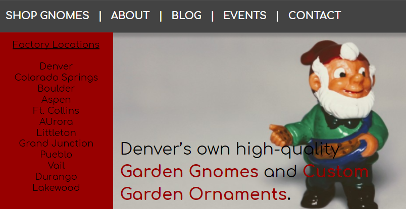
- Mega drop down menus
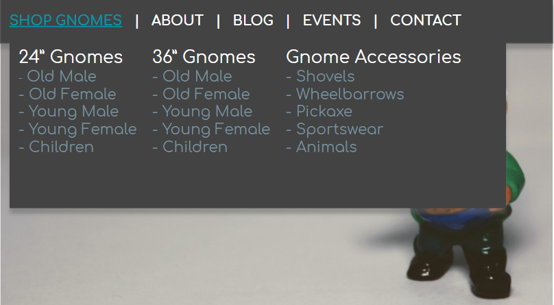
- Unnecessary side menus
- Unclear Menu Items
![]()
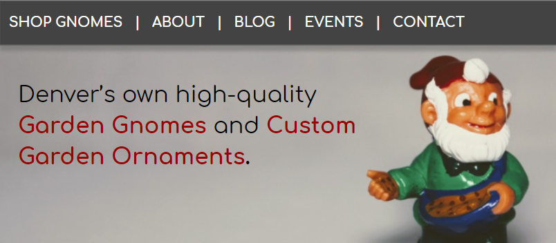
A heroic header.
Your header or “hero” image is typically the most impactful part of your home page. It’s where the eyes of each visitor inevitably come to rest.
Your hero must be:
- Simple – Your complicated imagery is better suited for a photo gallery. Use this opportunity impress your audience, not confuse them.
- On-topic – Following the Denver Gnome example, this is not the place for a picture of your team or office building. While those are important aspects of your company, gnomes are what you do! Don’t leave your audience in the dark or they will leave you!
- Original – Authenticity is the key to winning the first 5 seconds of a new visit. Your products and vision are awesome – show them off! Don’t hide your work behind stock photos or cliches.
Speaking of cliches…
A clear vision.
You have a vision – it’s why your business has been so successful! Expressing it is the most important element of a successful homepage.
Why you do what you do matters to you and to your visitors. Explain your vision in a way that makes sense for your visitors.
![]()
Include only what is necessary to convey your vision.
Let’s return to our Denver Gnome example:
- Where: Denver
- What: Gnomes and Garden Ornaments
- Specialization: “High-Quality” & “Custom”
- Placement: Title vision statement is located front and center, above the fold.
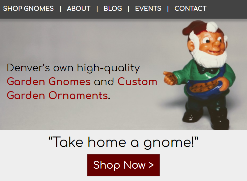
A compelling call to action.
A business like yours has a website for the primary purpose of selling more products so that you can bring joy to your customers and provide for yourself and your family. It is absolutely essential that your homepage answers the question, What do I do next?
Here are a couple examples of a quality call to action:
- Shop Gnomes
- Take home a gnome! Shop Now >>
Your call to action can be straight forward or unique, but notice that the unique line includes clear instructions. This sense of clarity is why your website “feels like home.”
While there still is no better feeling than coming home after a long day. Your website can still feel like home, providing visitors with a welcoming, familiar and intuitive experience by including the top 4 elements of a successful homepage we have discussed here.
What is your favorite element of a good homepage? Have questions or advice for building an online home?
Leave a comment below.