Some (maybe most) PPCers may not be gifted with an eye for simple design concepts, but that’s not to say there aren’t tons of resources at our fingertips to help us. You don’t need to have years of experience in Photoshop or other Adobe programs to create stellar display ads; there are plenty of sites out there that can help you.
You already know how to write great ad copy for your search ads, so let’s tackle those display ads.
In this post, I will review four easy things to keep in consideration when creating quick and simple display ads that will give you results you want.
1) Less Is More
First and foremost, stand by this rule when thinking up your layout: Less is more.

Clean, simple templates are not only easier to create, they are also much more appealing to the eye. Keep it simple, use colors that complement each other, work with your logo and use fonts that are easy to read (more on these later).
2) Hierarchy: Who are you? Why should I care? Where do I go?
With any good layout, hierarchy is absolute KEY. In our search ads, we are only given so many characters to make sure we bring in the right people who are searching for us. The same can be said for display ads, where we only have so much space to get the right message across – so we need to use it wisely.
Who are you?
‘Who are you?’ should be an obvious one. Let your customers know who you are and include your logo. Display campaigns can be great for brand awareness; we want to show the brand off at every opportunity. Making sure you have enough space set aside for your logo will help you determine how to map out the rest of ads important elements.
Why should I care?
Emphasize your value to your customers and make a point as to why they should care about your products/services.
Come up with a creative value proposition that is going to get them to click. If this is a remarketing campaign, keep in mind that you want the ad to be relevant to why they should return to your site and continue down the conversion funnel. Grab their attention immediately. Remember, you have roughly 8 seconds of someone’s attention span, so you need to be quick.
Where do I go?
They’ve seen your logo, they’ve read your value proposition, now what should they do next? Make sure your call to action is clear and apparent. This does not necessarily mean you need to use big bold typeface and flashy colors. Again, keep it consistent with the rest of the ads elements.
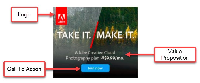
To point out the hierarchy here, we can see that the same logo is stamped in the exact position as all the other examples. The background is simplified by using one image then additionally the gradient effect they have working along with their value proposition. Lastly, their call to action is apparent, very cut and clear and follows the same suit as the ads shown below (consistency).
3) Consistency
I think “consistent” has come up once or twice now, so we can see how important it is. Especially when considering your branding, this is going to help you ingrain in your customer’s mind who you are the second they see your ads.
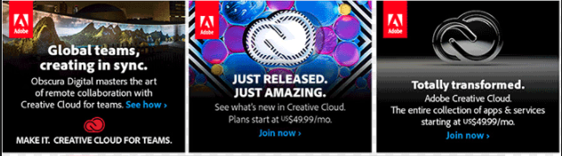
Here: Clear logo stamped in the same position, all of our ad text is the same typeface, our CTA’s are the same color with the same > element.
4) Clear Typeface/Imaging
Last, but definitely not least, keep your typeface and imaging simple and clear.
Across all sizes of your ads ,images should also be (if you haven’t guessed it) consistent! This will we be a major help when you start to test out different imaging and other elements of your ads.
Conclusion
If you take the time, anyone can learn more about how to create great display ad layouts.
Luckily, there is a nifty tool called YouTube that has thousands of tutorial videos that are extremely helpful for just about anything you want to do with any software.
And if Adobe products aren’t for you, there are many other programs where you can click and drag elements into the allotted space for you: