The call to action (CTA) is a small, but certainly not insignificant, component to the online buying process. If you’re unable to deliver a powerful call to action that goes beyond the basics, you’ll lose clicks, and, more importantly, conversions.
Simple “Buy now” or “Learn more” CTAs have become so commonplace that they’re no longer effective. Customers have grown increasingly sophisticated in recent years; demanding an intriguing call to action that captures their interest and leads them to valuable information.
In this column we’ll go over some CTA examples and discuss 9 tips that will help you write the call to action that motivates your demanding audience to click.
1. The power of the crowd
If you had 200,000 people telling you to sign up for a newsletter, you probably would. Right? Well, the folks at Content Marketing Institute think so.

They let users know right off the bat that thousands of people have already signed up for their regular updates. This tactic inspires confidence in the user who thinks, “if this many people have subscribed, it must be worth signing up.”
If you’ve had success in the past, don’t be afraid to share it with potential customers. It can be very persuasive when a significant group of people have already opted in for your services.
2. First person – I, my, etc.
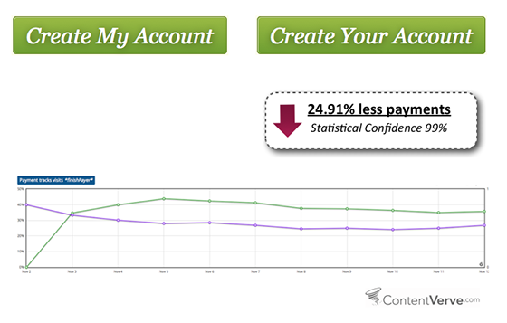
It may feel natural to use “you” or “your” when writing out CTAs (after all, when you’re writing on the web you do speak to visitors in the second person), but it’s not nearly as effective. “My” encourages the user to take ownership in the offering, and it’s a subtle reminder that “my” next click will benefit “me.”
In fact, an A/B test performed by Unbounce found that call to actions using the word “your” performed nearly 25% worse than the same call to action with “my.” These numbers speak for themselves; it may be worth trying out the first-person variation in your call to actions.
3. Compelling content
A good call to action is only as effective as the content that surrounds it. A big, flashy “BUY NOW” button on its own isn’t going to do you much good. Not only will this likely discourage your visitors from clicking, but it will also appear a little spammy (which may result in a lost customer altogether).
You need to complement your CTA with a strong message.

Red Cross hits the mark here with, “You can make a difference.” The first thing Red Cross does well is create a connection between the website visitor and all the people in the world who have been affected by disasters. The headline quickly evokes a sense of accountability from the user.
Red Cross also creates a sense of urgency with the use of red in the, “Donate now” button. The color red has been attributed to stimulating the body and encourages users to take action. (We’ll discuss the importance of color in your CTA a little bit more down below.)
4. Incorporate strong verbs
Verbs are the action words, so it’s no surprise that they perform well in call to actions. They provide clear instruction to users that there is something to do and elicit an action. Aside from the apparent relationship, strong verbs also help you stay clear from dull CTAs like “learn more,” “sign up,” and others that you and your users have seen hundreds of times.

In the example above, WordPress incorporates several verbs that get right to the point. They’re clear, descript, and they encourage users to take the next step. This examples also include subtle “learn more” options that point users to additional information, but let’s imagine those learn more CTAs were the only ones on the page. They quickly become a lot less enticing, don’t they?
Below is a short list of verbs that you can try in your next call to action:
- Begin
- Generate
- Track
- Make
- Grow
- Watch
- Analyze
- Discover
- Save
- Get
- Develop
5. Keep your CTA value-driven
People are always on the search for something that’s going to benefit them. If users aren’t convinced that your call to action will lead to highly valuable info, there’s a good chance they won’t convert. Differentiate yourself when you have the chance with a value-driven CTA that explains exactly why somebody should click.
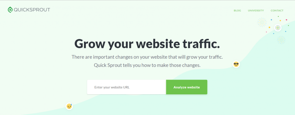
Neil Patel at Quick Sprout does an excellent job with this. Nothing is more valuable to somebody on the search to increase traffic to their website than a big, bold headline that reads, “Grow your website traffic.” Patel also uses an enticing verb in the button of his CTA that reinforces how important a compelling action word can be.
6. Free always grabs a user’s attention
If you’re able to offer a free trial or free sample of your product, go ahead and give it a shot. “Free” is a magnet for the user’s eye and it can be a great lead generator that establishes a relationship with customers.

Netflix may have one of the most famous free trials, as they’ve been reeling customers in at an exceptional pace (5 million new members in the first quarter of 2017 alone). And they’ve been accomplishing this momentum with a strong call to action like the one in the image above.
The headline, “See what’s next,” inspires a bit of curiosity in the visitor and has them wondering what kind of shows they can binge watch. They also reassure the user that there’s no commitment, they can cancel anytime. If you go the free trial route, it’s beneficial to let the user know there won’t be any surprise contract or limitations, transparency is key here.
7. Create contrast with unique colors
As mentioned in bullet two, the colors you incorporate in your call to action are immensely important. You need an effective contrast between the background imagery and the clickable button if you want to capture your users’ attention.
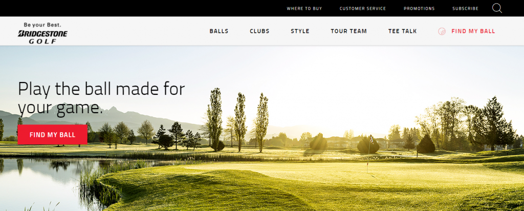
Bridgestone does an excellent job in the example above. The header image includes a monochromatic green color palette while the clickable asset, “Find my ball,” is a sharp, neon red color (HEX: EE2047) that piques the interest of users.
8. CTA on every page
It may seem obvious, but this post wouldn’t be complete without mentioning how important it is to have an accessible call to action on every page. Don’t leave your visitors hanging dry on a dead end. You may lose a lot of business.
9. Test. Test. Test.
If you want to run CTAs on your website that drive conversions and lead to growth, you have to test. Testing your CTAs will give you invaluable insights on how your customers are interacting with your business. The information you gather from running A/B tests on several CTAs will help you understand what it takes to turn a visitor into a buyer – the ultimate goal.
You need to analyze the data if you want your CTAs to be truly effective. Some of the techniques listed above may or may not be right for your business, but you won’t know that until you test them.


